Our passion for working with universities and other educational institutions means that we’re always on the lookout for campaigns that inspire us. Campaigns that dare to do something different, that are creative and brave, and that break the stigma of academia being a little on the dry side by choosing an imaginative and unorthodox approach.
So here, we’re bringing you our top picks of the best university campaigns. But this is only part 1. New ones are popping up all the time as more and more universities embrace a progressive drive behind their brand and marketing strategies.
A brand identity that packs a punch

Brand identity sets the tone. It’s about creating a feeling of relatability and belonging. And this is exactly what students want. They want to choose a university that they feel relates to them as a person, where they will thrive and where they will belong. In the flick of an eye, people make assumptions based on brand identity. Traditional vs modern, safe vs bold, up to date vs out of date.
SMK University of Applied Social Sciences in Lithuania nails it in terms of brand identity. It’s simple, but it packs a punch.
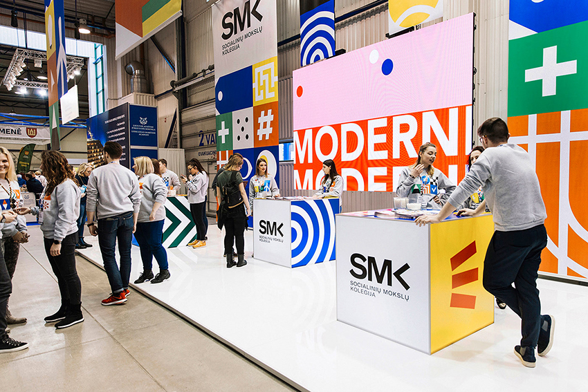
What we love:
- Really striking, bold iconography
- Vivid, impactful colour palette
- Great use of text, imagery and graphics
- How the clean lines of the brand design mirror those of the campus
- Brave and memorable website
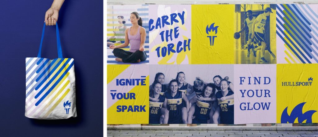
Hull Sport is another great example of strong brand identity. We especially love the photography and graphics used in this one.
An eye-catching website
A university website will be one of the first touchpoints for prospective students as they start to research where they want to spend the next few years of their life. A boring, uninspiring, hard-to-navigate website will see them click away within seconds.
Universidad Villanueva in Madrid has a website that ticks lots of boxes…
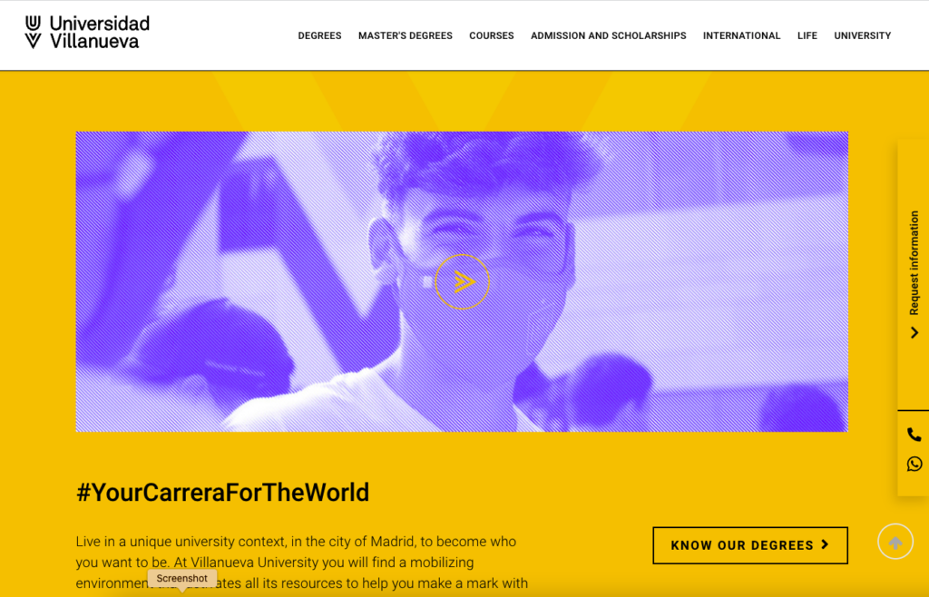
What we love:
- A considered and well-executed design
- Eye-catching and beautiful layout
- Great user interface – easy to navigate
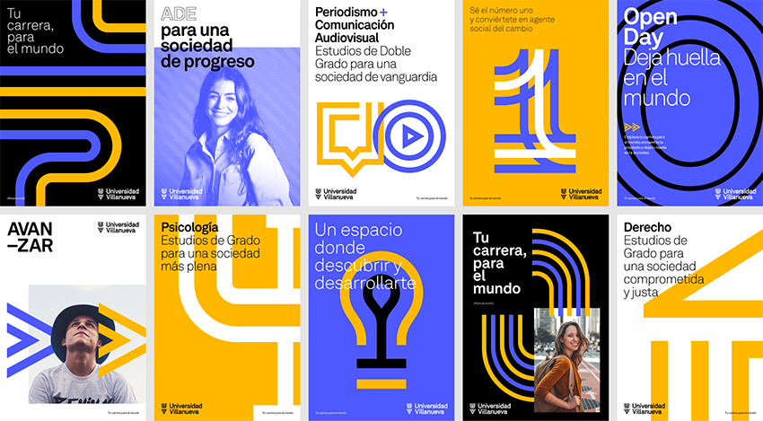
- Double lines that guide you through and encourage you to keep scrolling
Show-stopping personalised videos
Loyola University Maryland stole the show when it came to stepping outside the safe zone. Not only did they decide to use video in their campaign to tell new students they had got a place, they used personalised videos! You can read the whole case study here, which includes their journey to realising the impact of personalised videos and the incredible results they garnered… including a whopping 81% engagement rate!
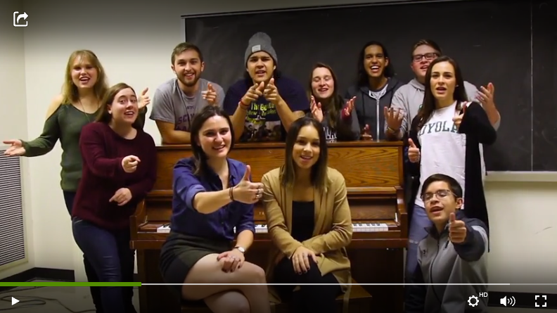
Spurred on by their success, their future marketing strategy plans are becoming bolder and braver. Genna Mongillo, Director of Marketing and Communications for Undergraduate Admission at the university, says:
“We’re looking at using personalized video for our accepted student open houses. We have thousands attend every year. Imagine how excited they’ll feel if they register and immediately get a personalized video confirmation?”
A visual style with impact
The Shillington School of Graphic Design found a wonderful virtual solution for their graduate showcase campaign. Their students had spent most of their year separated from each other and their teachers due to Covid, but they still found an impactful way to celebrate their success by exhibiting their work online.

What we love:
- The dreamy pastel colour palette and bold infographic style
- How their copy not only celebrates their recent graduates, but simultaneously explains to potential students what success at Shillington looks like:
“Check out the incredibly diverse range of work produced by our Sydney, Melbourne, Brisbane, New York, London and Manchester students. Before Shillington, the majority had never touched the design programs and yet in just 3 months they have the technical and conceptual skills to create a beautiful body of work.”
A simple but striking logo refresh
Another example from Lithuania, the European Humanities University’s logo and branding refresh is a shining example of how outdated designs can affect the immediate impression for potential students. This logo and branding refresh is yet to be applied to the website, so the before and after is plain to see.
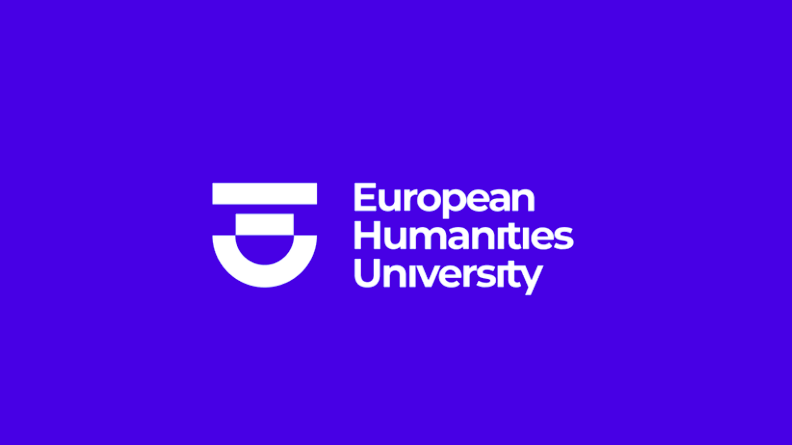
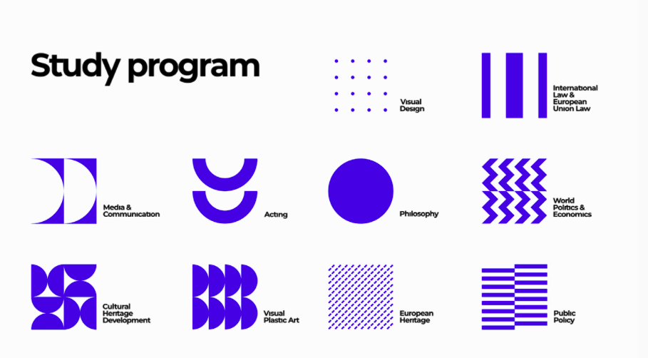
What we love:
- Maximum impact created with very few colours
- Variations of circles and lines used in a clever way to create icons and graphics
- Each study program has its very own striking logo, taking identity one step further
Copywriting that breeds connectedness
Here we choose a university much closer to home. The University of Nottingham knows how to do copy. Their strapline on their homepage is: ‘We don’t settle for ordinary. We believe in a world beyond ordinary – a place where normal gets put firmly in its place.’
What we love:
- Clear and simple messaging that’s full of connectedness, belonging and ambition
- It’s empowering and motivating and makes students think, ‘Yes, I can do this!’
And it oozes out of the amazing script for the welcome video they did for the September 2020 intake, right in the middle of Covid:
So there you have it, our top picks of the best university campaigns. As more imaginative campaigns that live up to the demands of today’s digitised and experience-rich world arise, we’ll be sure to showcase them in another blog post. Keep your eyes peeled!
Here at Seed, we love collaborating on creative and imaginative projects with universities and other educational settings. From brand strategy and consultancy to visual identity design, animated white paper explainer videos and digital marketing support, we offer a range of services that makes individual institutions stand out of the academic crowd! Get in touch and book an exploratory call.
Like this article? We’ve got loads more where that came from. Sign up to Project: Insight, our fortnightly email digest for best practices in research dissemination and creative innovation for projects.

Written in collaboration with Jo Berthalot.
