Okay, we lied. There is no perfect website. But what we can share with you is our four-step formula to creating a website that builds brand awareness; generates traffic; convert visitors into leads; helps build your team and grows your organisation.
Ingredient 1: User-Experience (UX)
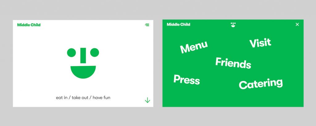
A website shouldn’t just ‘look good’, it should be easy to use and navigate, as well as provide visitors with a quality experience they’ll want to return to over and over again. Put simply, UX is how a person feels when they are on your website. By understanding what customers want from your site, you can build it from the ground up. Ensure they have the best experience possible. This website from Middle Child, a modern diner in Philadelphia, is an example of top-notch UX design. The site’s simple colour scheme and sparse content allows a lot of room for white space, pulling attention to large elements and calls-to-action. Menus are well-organised and concise, making the site easy to navigate and more enjoyable for the user. Quirky animations and micro-interactions create a memorable experience, adding personality and taking away from the sometimes dull aspect of navigating the web. Underlying all of this are detailed and well-thought-out UX components, driven to enhancing customer satisfaction.
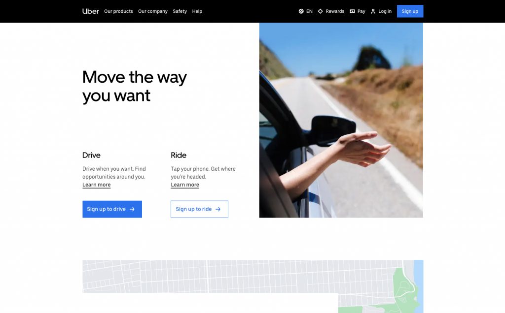
But not every business can have a fun and kooky website. And that doesn’t mean that your site can’t meet customer demands and retain their attention. Take Uber, for example: as soon as you enter their site, you are greeted by two simple options, ‘drive’ or ‘ride’. This immediately fulfils a visitor’s need and provides Uber with an effective way to employ new drivers and earn new customers.
Ingredient 2: User-Interface (UI)
While UX focuses on the experience of a website, UI focuses on the visual design and aesthetics of a site. The interface of your site will often consist of elements such as buttons, text, images and sliders, as well as small interactions like animations and page transitions. Along with the layout of your website, these components should all establish a clear visual hierarchy and aesthetic throughout your site. This makes it visually stimulating and straightforward to use for visitors. When it comes to UI, less is often more, as shown in this example by Wealth Simple:
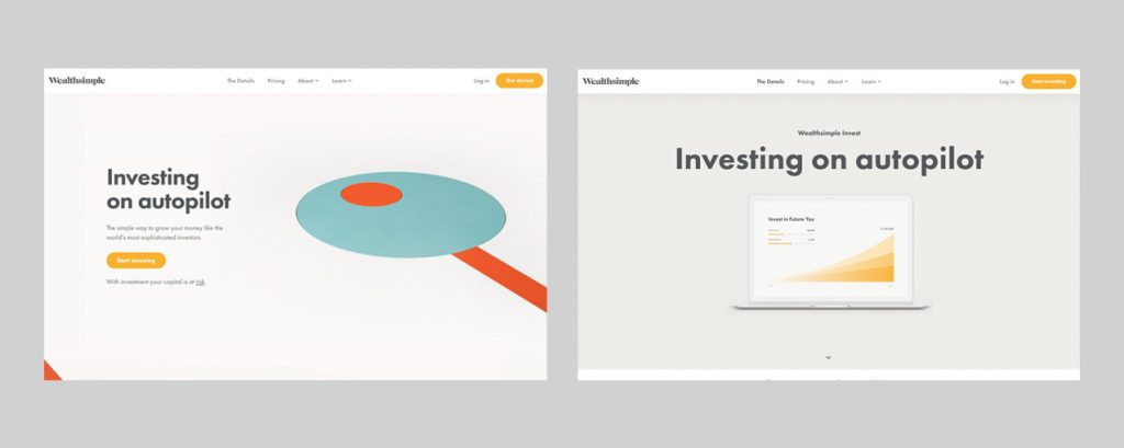
Wealth Simple’s minimalist website combines appealing animations with a simple layout to help users understand their investment service. It’s important to remember that well-considered and consistent aesthetics, such as those on this site, all stem from a strong brand style and clear guidelines. What could’ve been a cluttered and complicated website is now a clear-cut and efficient business tool.
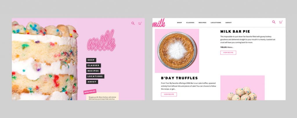
Your interface can also be a valuable tool to show off products and services. In this brilliant site by the dessert and bakery chain Milk Bar, large scale images are used alongside minimal text to exhibit their delicious line of sweet treats (we don’t know about you, but we already want to try them!).
Ingredient 3: Search Engine Optimisation (SEO)
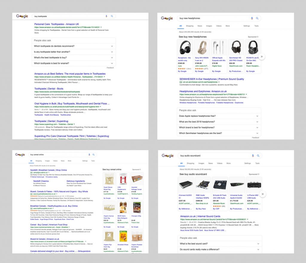
As more and more consumers use search engines to find products and services, SEO continues to play a critical role in driving targeted traffic to websites. By optimising your site for search engines, you are delivering better information about your business so that it may be ranked higher in searches and displayed to relevant audiences. Amazon is a brilliant example of a business who consistently appears high up in Google’s search rankings. To put this into perspective, we searched for four (very) unrelated products on Google and found that Amazon appeared in the top three results each time:
Getting these top positions can be integral to building brand awareness and reaching new customers.
One of the best-performing UK companies on search engines in recent years is online fashion retailer ASOS. ASOS have been crowned as the “king and queen” of organic Google search, beating high street stores such as Debenhams, John Lewis and House of Fraser. Examples like this showcase how online companies can outmanoeuvre their real-world competitors by investing in their SEO.
Ingredient 4: Content
High quality, well-crafted content is the key ingredient to guarantee visitors will keep coming back to your site. Bad content, on the other hand, can send them running. Ever visited a website and been met with the horror of a heavily-pixelated image or misspelt word?
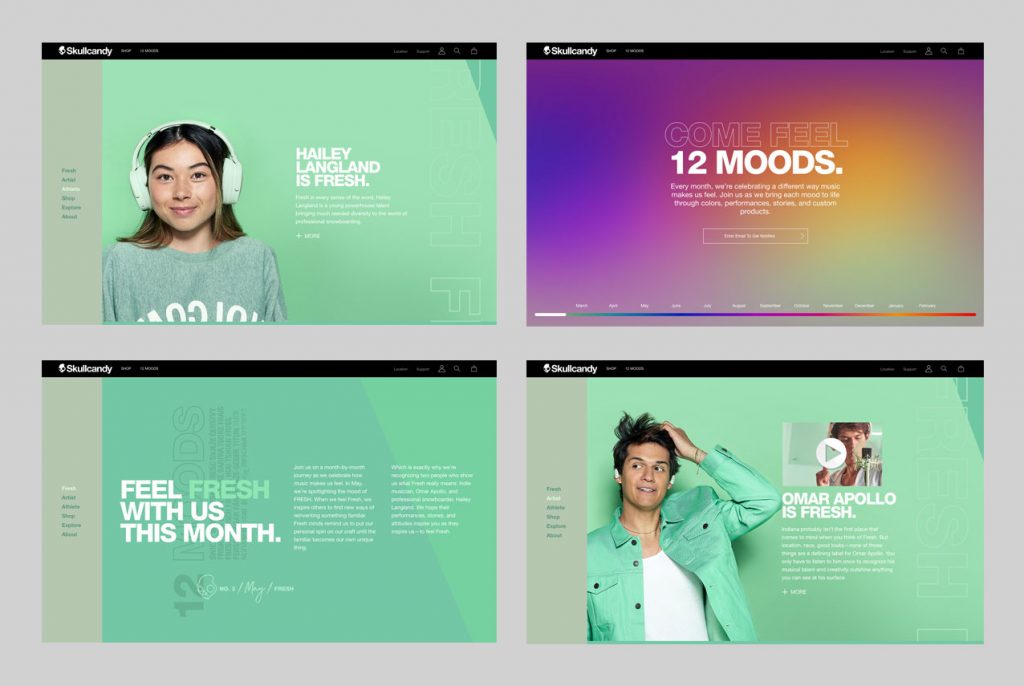
Good, compelling content will not only give internet users a reason to visit your site, but will also give them something worth sharing. Headphone manufacturer Skullcandy are an excellent example of a business frequently generating content for their website visitors to enjoy. Each month, Skullcandy share exciting and unique stories from athletes and musicians in the form of short documentary-style videos. These promotional videos brilliantly represent Skullcandy’s brand and engage audiences without having to go for the hard sell.
The End Result
If you can succeed in ALL four of these areas on your website, you’ll have an invaluable tool at your disposal, vital for building brand awareness, generating leads and converting them. While most agencies will focus on improving the visual side of a site, we at Seed work on optimising all four of these areas on the websites we build. We believe that these four areas are of equal importance, and so should be considered and developed equally. For example, a site can look great and function brilliantly, but if it hasn’t been optimised for search engines, it will be difficult to find. This is why our handy network of designers, copywriters and SEO specialists are on hand to create the best websites possible for our clients.
If you’re looking for someone to update your website to grow brand awareness and drive sales, or you’d simply like to find out more, we would love to hear from you. Get in touch here.
