Fighting for the attention of customers online has never been harder. With so much choice, why should people choose to use your website? The important word here is ‘use’: your website does not stop at the customer clicking on its link. This is just the start; you need them to use it, to stay on the site and be led along your customer journey. Engagement cannot be assumed.
This thinking is becoming more prevalent; as your competitors step up their game with improved design interfaces and helpful customer-centred content, how can you take your site to the next level? How do you use your website to not only compete, but to thrive?
The answer: micro animations.
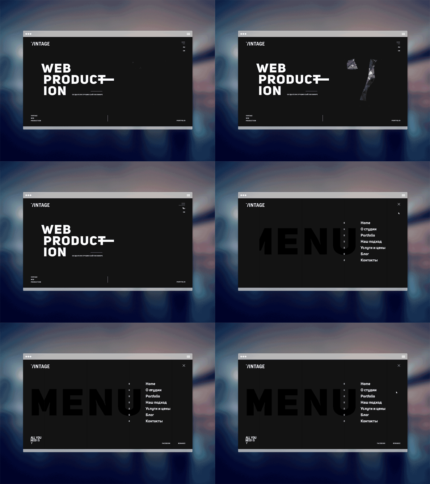
What are micro animations?
Micro animations, or micro interactions, can be thought of as the body language of websites. All the little motions triggered by interacting with the website that help you understand it and successfully engage with it.
Micro animations are everywhere… in fact, I’m looking at one right now: the little blinking text cursor waiting for me to start typing again. It’s small but this little motion lets me know where I’m typing and that it’s ready for me to continue.
Of course micro animations move way beyond a little flashing vertical line, and just like body language, they can go from really subtle to very expressive. The more subtle side of things could be the way a page slides away on a smartphone or a colour change as you hover over a button. More dynamic interactions could include a loading animation using brand specific imagery or page interactions triggered by scrolling.
How could they help my website?
Whatever the purpose of your website, you have an objective with each visitor: you might want them to purchase products or services, access or give information or contact you for a meeting.
Whatever this aim, is your website needs to:
- Keep people from clicking the dreaded ‘back’ button
- Lead them along your customer journey in an enjoyable, interactive and easy manner
- Create an experience that supports a solution to the customer’s problem
- Produce a positive experience, earn attention and develop trust, so people will reuse your site or recommend it to others
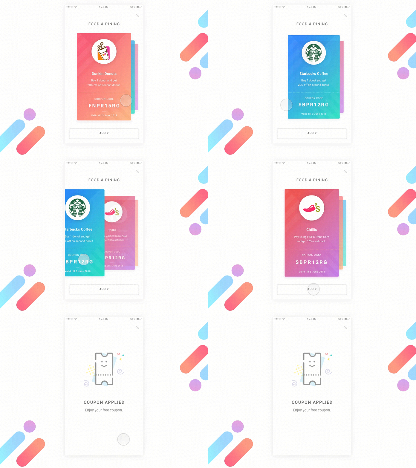
There are many considerations needed to address these elements, but micro animation can be a helpful tool to achieve all of them. Use animation to make the website more enjoyable and user friendly, therefore making visitors more likely to stay on the site and follow through on your aim.
So how do micro animations actually achieve these aims? Here are 5 key examples:
1. It’s Alive!
Including micro animation gives the user an immediate visual response to their actions. This increases the sense of direct manipulation and shows the website working with the user. With something as simple as a button changing colour – suddenly, it’s alive! The user knows your website is working and they are along the right lines with their interaction.
Returning to our body language metaphor, we’ve all experienced an interaction with someone lacking expression, where you get little or no response to your conversation starter. Do they understand what you’re saying? Did they even hear you? Maybe they don’t like you? You’re probably not going to stick around to keep it going. Conversation over.
All it takes is a nod of acknowledgment, a smile, a spark of life to create a two-way interaction. A website is no different: don’t let it ignore your customers. Little animated flourishes are the response to your user’s call.
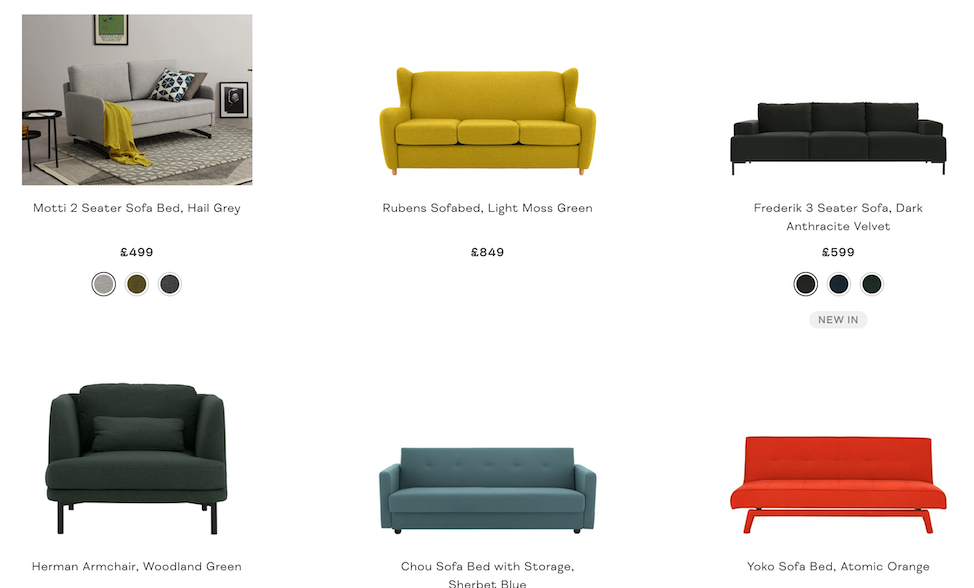
A simple yet effective example in retail can be found on MADE.com’s website. As your cursor hovers over a product, a simple product shot becomes an in situ photograph, showcasing the item in the context of a furnished room. This not only immediately indicates which item you are hovering over and that the image functions as a button to this item’s page, but also gives you further information about the piece of furniture that can help you decide whether to click on it in the moment of indecision.
2. Show Don’t Tell
Micro animations can mirror real-life interactions that users inherently understand. From loading bars that fill up with progress like a glass of water, to a page transition that mimics one sheet of paper sliding in front of another. The user knows what’s going on without explanation. This is especially helpful when dealing with phone screens that have less space for explanatory text. This capacity also makes interactions feel a lot more natural.
This is seen subtly in the typical buffering/loading circle, showing the need to wait, through a repetitive motion that usually mirrors the clockwise motion of…well, a clock.
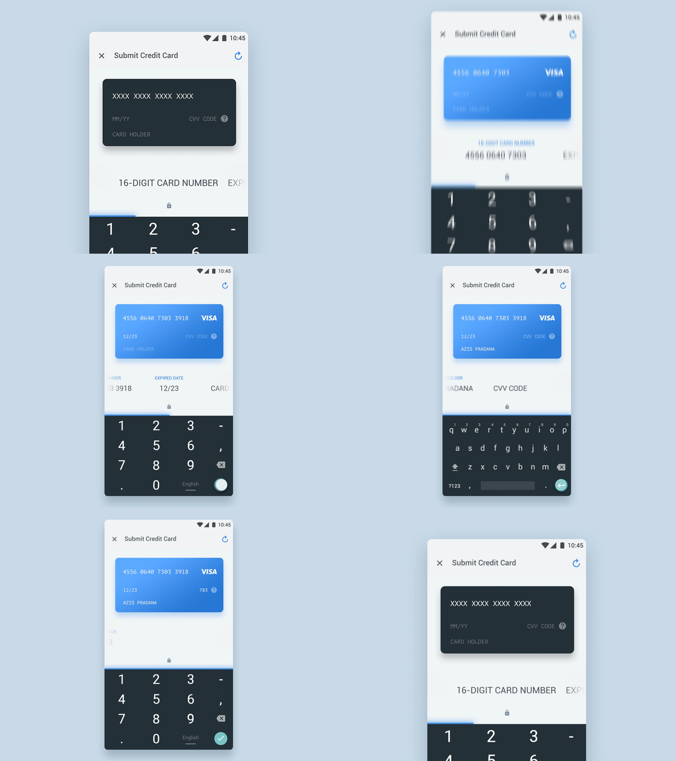
In Azís Pradana’s concept card interaction this concept is used more literally, with your information appearing on a virtual credit card as you fill it out. Giving a real life correlation means it’s self explanatory, especially for users who aren’t so computer literate. It feels more natural, so we’re more drawn to it.
3. Directing Attention
With thanks to our hardwired fight-or-flight response, we instinctively react to movement. It gets our attention instantly. We no longer need to stay alert for prowling sabre tooth tigers, but the impulse remains. Use it to your advantage when building your site. Micro animations can catch the user’s eye: draw them in and help direct them through processes smoothly. For example, making the ‘purchase’ button gently flash when the user has input all required information indicates that they can move on. Make sure they aren’t left hovering on the page, wondering if the process is finished yet.
We used this concept in our redesign of the Morningside Pharmaceuticals website home page. A micro animation triggered by scrolling down the page shows key figures counting up as the circles around them close. This movement catches the eye of the user and directs their attention to statistics that the company is proud to share with their audience.https://player.vimeo.com/video/357788738?dnt=1&app_id=122963
4. It’s All Connected
Micro animations can give context to actions on a website, further helping a user to become familiar with its use. Akin to giving someone a map with a highlighted route, as opposed to a list of directions. The instructions are helpful, but the map allows the user to see themselves in the wider context of the landscape, allowing them to stray from the path if they need to, without getting lost. This helps navigation in many apps, with a menu popping out from its icon or dropdown lists clearly showing how aspects are ordered.
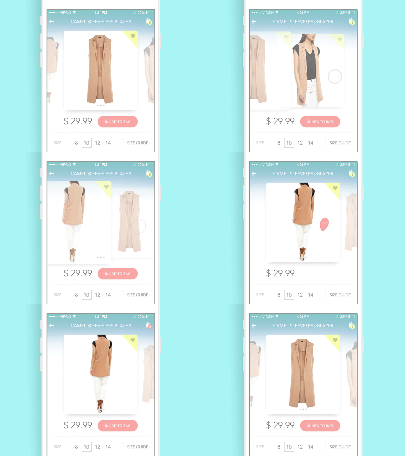
Consider this micro animation by Alla Kudin for Tubik Studio: here, when you add an item to your shopping bag you can see a direct line or correlation. The ‘add to bag’ button becomes a tick that moves up and drops into your bag’s item counter. You can clearly understand that this bag icon is where your items are being saved. So if you want to review your shopping bag or head to the checkout, you know where to click.
5. Let’s Add Some Fireworks
Last, but by no means least, micro animations can make your website a whole lot more fun and enjoyable. All the other benefits of micro animation are great but let’s be real: people are only really going to remember the fireworks. The little quirky motions or smooth movements and that just add style to your interactions. After all, with the means to make a fully functional website becoming more accessible, people are beginning to expect websites to be usable as a base line. So you need to create a positive, memorable experience that will keep them on your site and coming back for more.
Your micro animations can display the character of your brand, whether you want to come across as friendly and informal or smooth and professional. These interactions don’t have to be overly zany, as demonstrated by a very slick use of micro animation on Airnaut’s website. A scroll-triggered interaction wipes away the information above as you move down the page, keeping the user engaged and keen to see what’s next.https://player.vimeo.com/video/357791035?dnt=1&app_id=122963
So, there’s massive potential in the use of micro animations to enrich interactions and build engagement. Hopefully we’ve left you feeling inspired to think about your own. Websites are quickly becoming more animated and interactive as devices become better able to support such features. So don’t be left behind.
Use micro animation to:
- Support the user by showing the results of their interaction immediately and not letting your website give them the silent treatment
- Allow your users to understand how to use your website without text-based explanation, through mirroring real life interaction and allowing them to see their interactions in the wider context of the site.
- Draw the customers attention to what is most important to you, or what is of most use to them, by helping to navigate complex interactions
- Build a truly enjoyable experience that leaves them with a positive and unique impression of your brand
Time for a Challenge:
Take a look at your website and see if you can answer the questions listed below
Remember you are an expert in using your site but your customers won’t be. Try to see it from their perspective; get some feedback from others or maybe start with a website that’s unfamiliar to you then apply your findings to your own site
- Is the site working with you, or are you doing all the work?
- Is it easy to navigate or do you find yourself clicking in circles?
- Do you enjoy using it?
- What would you do to make it more interactive?
- How can you employ micro animations?
Get in touch to book a discovery call.
