Isn’t it annoying when you’re trying to have a conversation with someone but they are distracted… looking at something else, listening with only one ear. It’s hard to get your point across, and even though you’re talking, you’re not sure that they’re listening and taking all the information in. This is effectively the exact situation you are creating when you give a presentation with PowerPoint slides that are overloaded with information. You’re talking, while your audience is trying to follow and digest a long slideshow of content-heavy slides. The result? A PowerPoint presentation that risks dying a death.

The fact is, people simply cannot successfully listen, read and think all at the same time. Alan Baddeley, a British psychologist, explains this using his model of working memory.
So here’s our guide to creating a presentation that grabs attention...
How do we retain information?
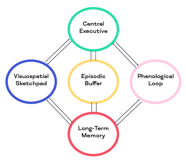
There are five key parts to this diagram that illustrate the way we remember things:
Central executive
This is the driver of the system and controls the flow of information, starting the transfer process to committing it to long-term memory.
Visuospatial sketchpad
This is the part of short-term memory where we interpret visual information. It incorporates anything from videos and images to font style and colours. And we mustn’t forget that the movements and gestures of the presenter come into play here too.
Phonological loop
This part of the short-term memory deals with information we hear and includes what the presenter is saying, as well as noise from the presentation itself in the form of videos or sound effects. What’s really interesting here is that this element also includes people’s inner voice – so consideration has to be given to letting people process that and their thoughts.
Episodic buffer
This is a type of temporary or extra ‘storage tank’ that receives both visual and auditory information and integrates it to create a unified memory.
Long-term memory
Information from all of the other components is committed to long-term memory.
BUT… there is limited capacity and any element can easily become overloaded, resulting in communication breakdown and information slipping away before it hits the long-term memory tank. And this is where we see the problem of you talking through a presentation while your audience is trying to process too much information on your slides.
We imagine you’re nodding along here, as it all makes a lot of sense when we see it set out like this. Yet, time and time again, we see poorly designed PowerPoint presentations that are text and graphic heavy, and simply too hard to digest.
So we’re here to give you some pointers on how to create a well-laid-out, engaging presentation. And the main message is going to be – less is more.
Close PowerPoint
We know the temptation. You get asked to do a presentation and you automatically want to reach for the laptop and open PowerPoint – a nice, crisp, blank canvas to download your thoughts onto. But hold your horses, stop, and hit the close button. You could even go further than that… and close your whole laptop. Pen and paper can be great when planning a presentation, using separate pieces of A4 paper to set it all out – one piece of paper for each slide.
Write down your key points
Write down the key points that you want to get across – one per slide. Use short, snappy sentences. No long paragraphs. A blank slide with just one sentence, or a few words, can be really powerful.
Sketch some visuals
Let your artistic side free and sketch out visuals that can go with these key points. More on visuals below…
Reduce, reduce, reduce
Now you have your basic design – a pile of A4 pages with short snappy sentences and sketches on them – ask yourself this: Can I cut it down? Do I really need every slide there? Are there any sentences that could be shorter? Would bullet points make the information more accessible? Do I even need any text? Don’t use words just for the sake of it. Sometimes graphics are enough on their own.
Open PowerPoint
At this point, you can now open PowerPoint and start to design your slideshow. A key point to remember here is that your PowerPoint isn’t your presentation – and it’s not your script. It’s a visual aid to your presentation. What you say is the auditory side. So this section is largely going to be about visuals.
Images, illustrations and graphics
There is such an array of choice here… photos, graphs, maps, comic strips… the list is endless. But we want to make two really important points here:
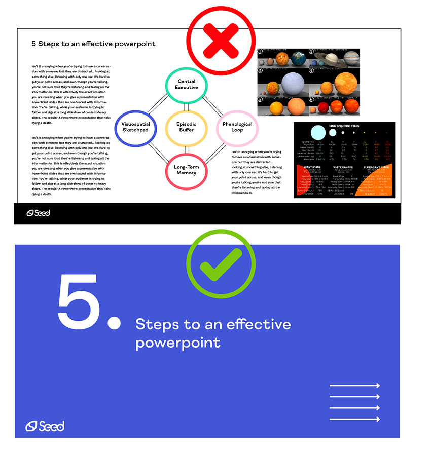
- Use one image per slide, max. Make it full-length to fill the slide. If you need text, put it at the bottom or even on the next slide.
- Create images yourself. While there’s a plethora of stock content out there, remember that a presentation is an extension of your brand’s visual identity and a great opportunity to strengthen it. So spend time creating simple but striking images that are fit for the exact purpose you need them for.
Videos and animated explainers
Videos are a great way to start a presentation. They can give it context and summarise the contents, providing that all-important hook for your audience to get them engaged right from the word go. If you find yourself with a particularly complicated point or graphic, animated explainers are a fantastic solution to break down the information, adding in movement to make it more digestible. They also offer you the opportunity to walk people through what you want them to see on the slide.

Our one rule? Less is more
You’ll notice that, up until now, we haven’t mentioned any rules on how many slides you should have in a presentation or how much text you should have on a slide. We’ve just said ‘less is more’. Why? Because that’s generally the rule that works best.
Google may tell you otherwise, but you’ll be met with a huge range of answers. The thing is, if you try to fit your content around a certain number, you won’t be truly thinking about how many you ‘need’. The rules may say 10 slides for a 20-minute presentation, but you could create an epic deck of just 5 slides that gets your point across in a much more effective way.
So our one rule? Less is more. And to drive the point home one final time, think about this… say you gave your audience the slides before your presentation, would they still need to come? If the answer is no, then you’ve overloaded your slides with content. If the answer is yes and what your slides do is create suspense and incite them to come along to know the rest of the story, then you’ve cracked it!
Keen to find out more about how Seed could help you make your PowerPoint presentation one to remember? Click through to our content page and book a discovery call.
Like this article? We’ve got loads more where that came from. Sign up to Project: Insight, our fortnightly email digest for best practices in research dissemination and creative innovation for projects.

Written in collaboration with Jo Berthalot