An ambitious tech start-up approached us with a request to help them build a brand around their innovative technology for elderly care. It was a complete blank canvas: they didn’t even have a company name yet, so we had a fun challenge ahead of us.
As always, we started with the all-important brand strategy sessions. What was their brand purpose? Message? Vision? Loads of discovery, ideas and critique led to a blueprint for the brand. With this, we could set about creating an identity.
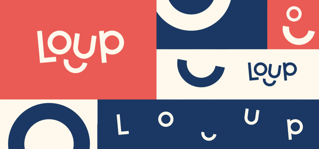
First, the name. After a lot of research, we decided on Loup, for two reasons. Firstly, ‘loup’ is French for ‘wolf’, an animal known for prioritising family and caring for the elderly. Secondly, the technology keeps families in the loop with the elderly relatives’ health and progress.
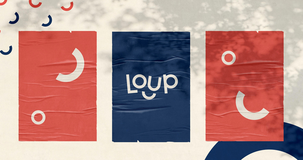
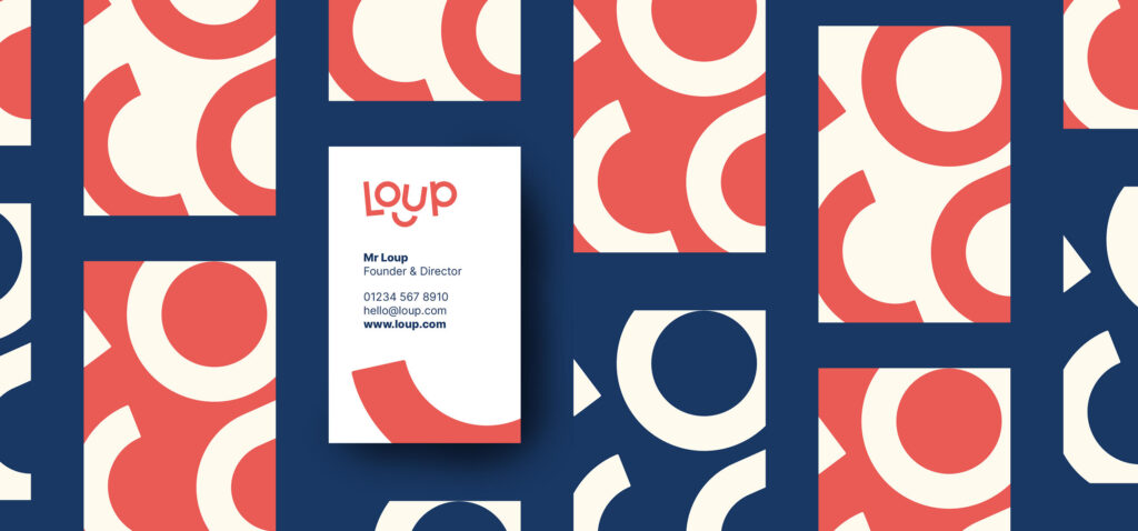
Onto the identity. The client was keen to stray from the obvious healthcare aesthetic: cold blue tones and clinical typography. So we opted for something a little more welcoming and playful.
We work with start-ups, global brands and everything in between. Our clients come in every shape and size – as long as their values match ours, we’re always excited to start a new working relationship.
Fill in a few details to request a free discovery call with our creative director (fields marked with an asterisk are mandatory):